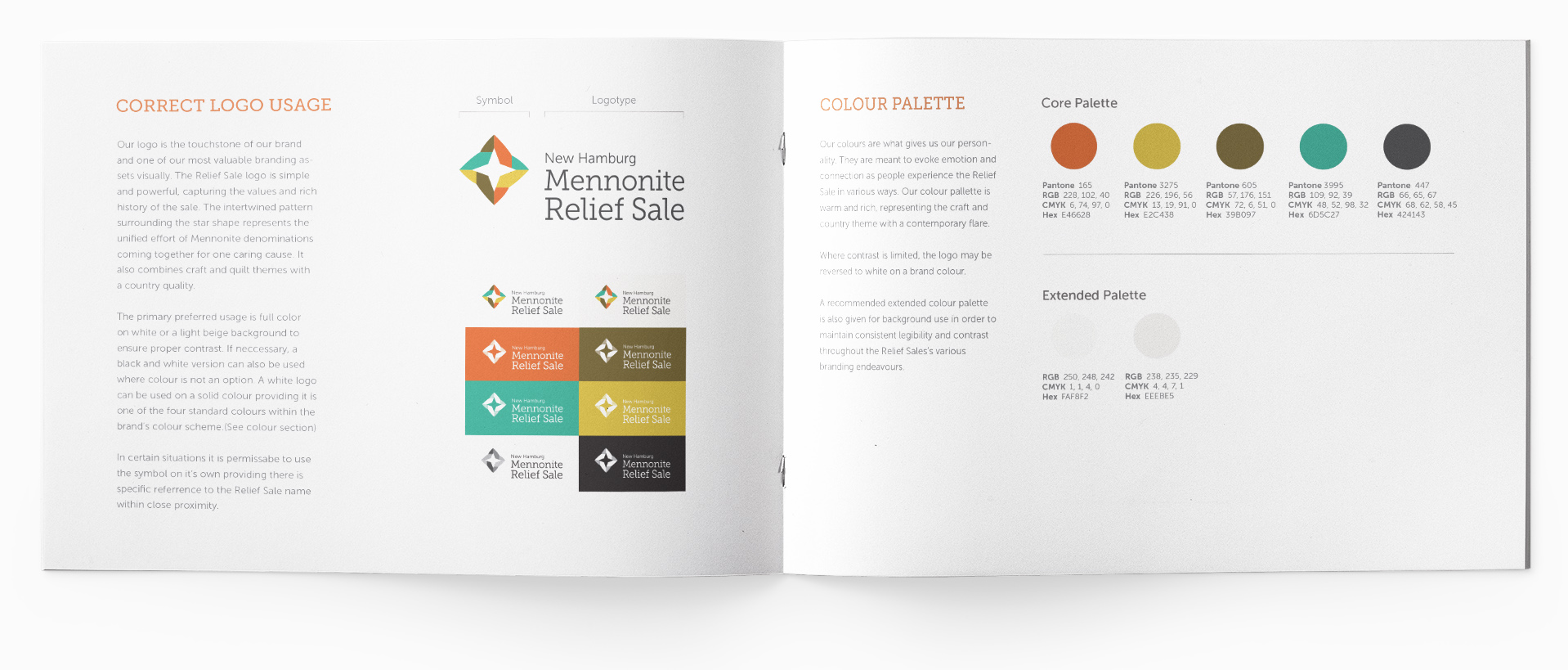
Conception & Brand Development
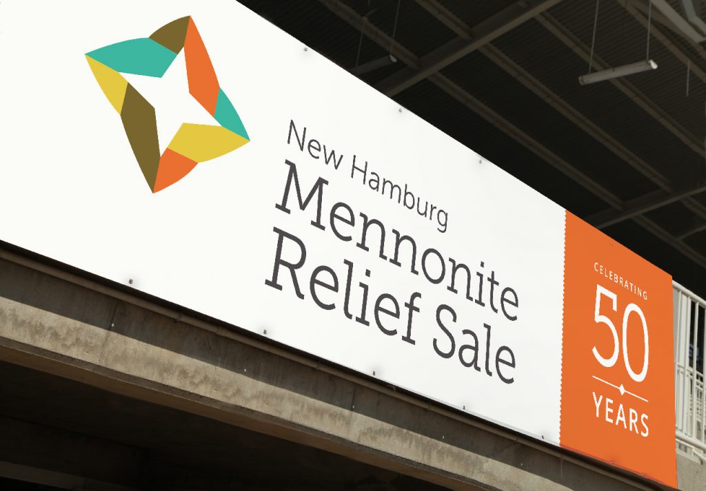
The primary goal of the brand redesign was to create a fresh, authentic and more current identity, while honoring the rich history the last 50 years represent, and acknowledging the sale’s diverse roots and supporters. The brand also needed to work across a wide variety of layouts and applications. Working from three main concepts, the final logo combined craft and quilt themes with a country quality. It showcases the nature of the products for sale as well as the values of the event itself. The intertwined pattern surrounding the star shape represents the unified effort of Mennonite denominations and communities coming together for one caring cause.
Before
After
Print & Signage
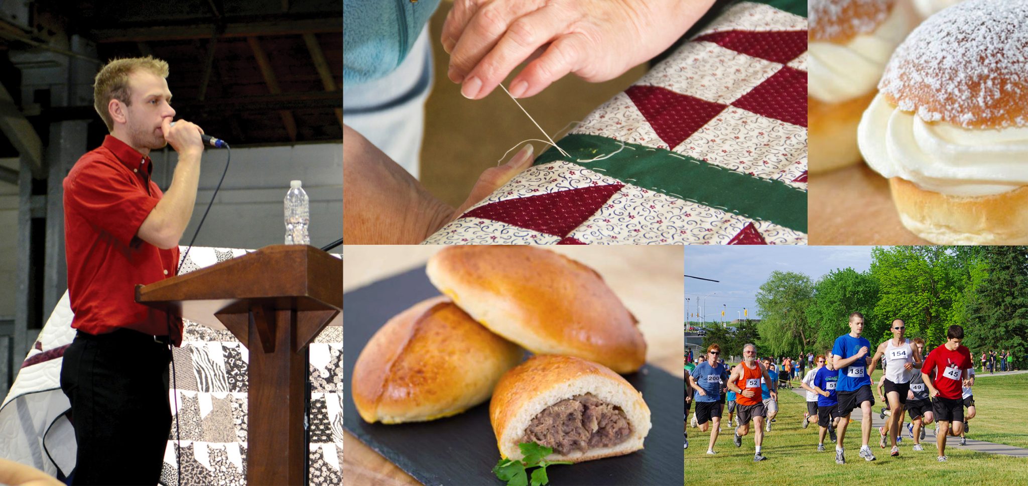
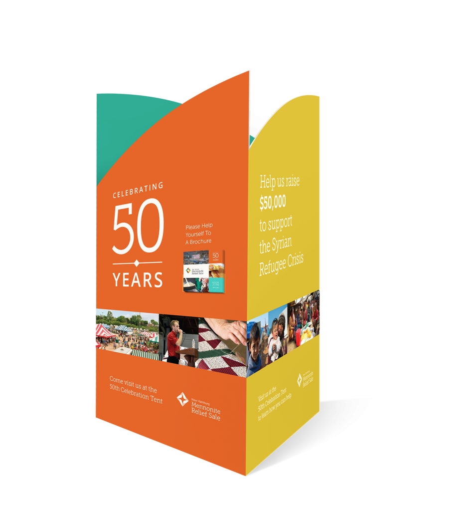
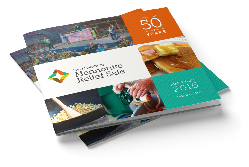
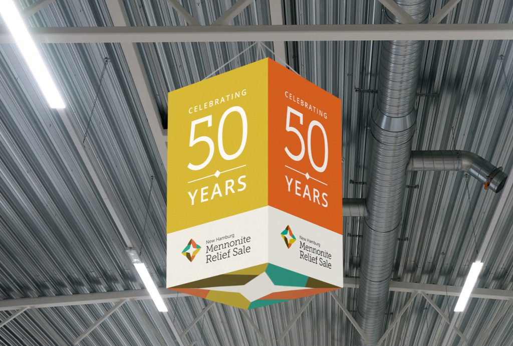
Of course, a community event like the Relief Sale requires a wide variety of print media, from event brochures to signage to volunteer apparel. Signs included free-standing information booths, road signs, wayfinding signs throughout the premises, ceiling signs and more. We were very careful that each application reflected the new brand consistently and showcased the 50th anniversary in a memorable, visually captivating way.
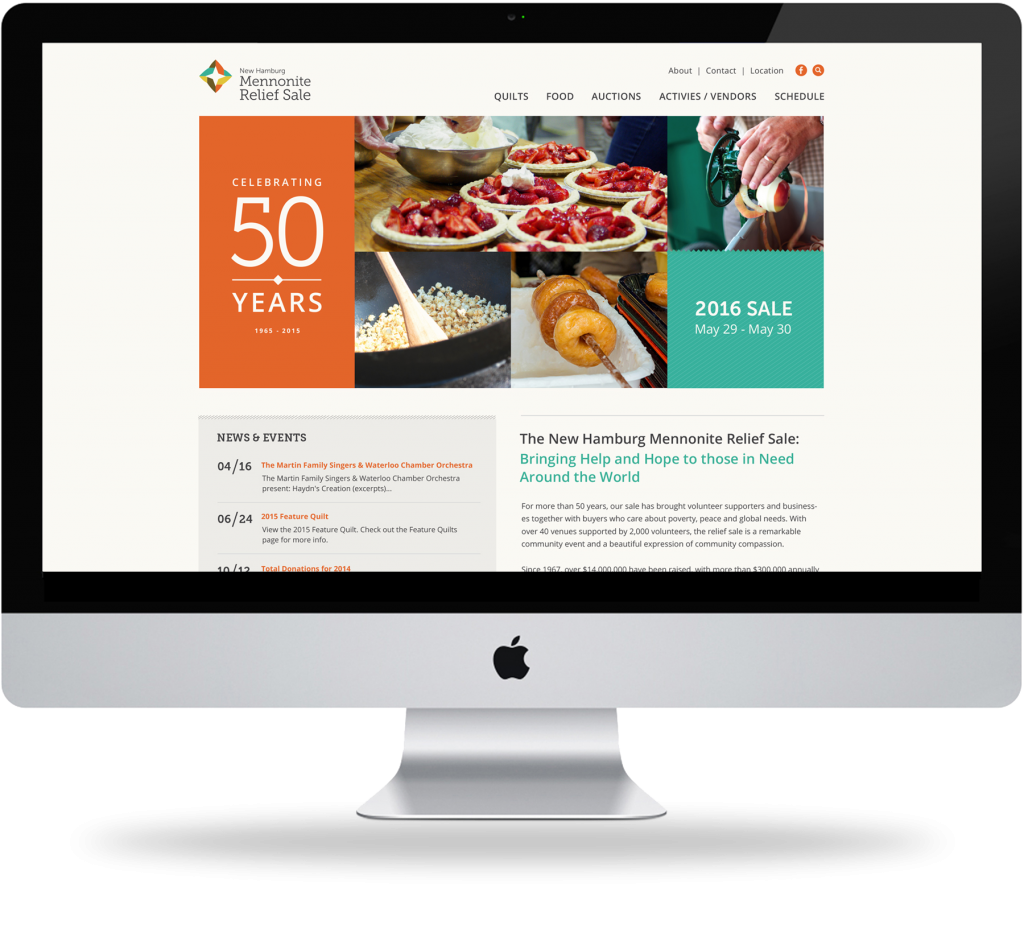
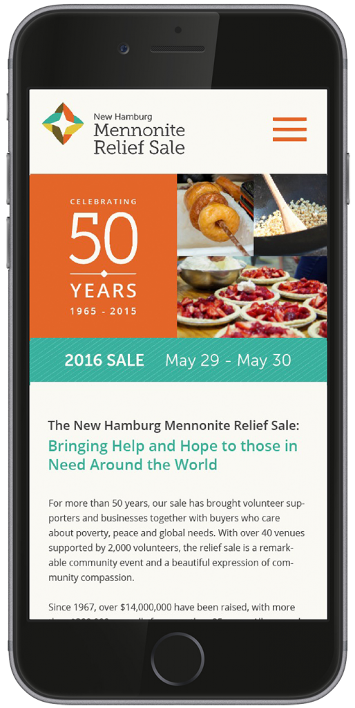
Website Design & Development
One of the Relief Sales primary needs was an all-new website that included a fully responsive design and consistent messaging. It needed to include a lot of content, including event overviews, organizational specifics and ongoing news and events. To maximize usability, we began the design process by creating a hierarchy of the content, ranking it from most important to least important. We also considered the importance of meeting the needs of both new visitors to the site looking for general details and repeat visitors who would be looking for more specific information. The result was a fresh, responsive website that offered comprehensive information about the sale, relevant news and resources for donors and vendors.